How a User Flows

When using an app, there’s times where it feels like you’re not even thinking what you’re doing next, rather just flowing along with the app. Whether it’s the dreaded infinite scroll or purchasing an item online, apps often put you in the headspace where you’re simply doing, not thinking. The question is, why does this happen?
UX Flows
Similar to the flow state in Psychology, as coined by Mihály Csíkszentmihályi, a UX flow describes a focused mental state where the user is completely immersed in an app. When in this flow, users aren’t specifically thinking about what action to do next, but rather being “guided” by the app on what to do next. For example, if you were using Amazon to buy a movie user flow would go
Search for item -> Select item -> add item to cart -> purchase item
While this is fairly simple, you don’t have to think much about it due to how Amazon is designed. Each step logically leads to another, allowing the user to easily flow from one step to another without having to think too much.
Designing a user flow
In UX Design, flows, as shown by Camren Browne of Career Foundry, the main reason is that it’s the best way to make an intuitive interface. If a user has to stop and think every time they go to a new page, they’ll quickly grow frustrated with the app. This doesn’t mean you completely railroad the experience, but rather design specific scenario’s a user may see, creating the best user flow for that action.
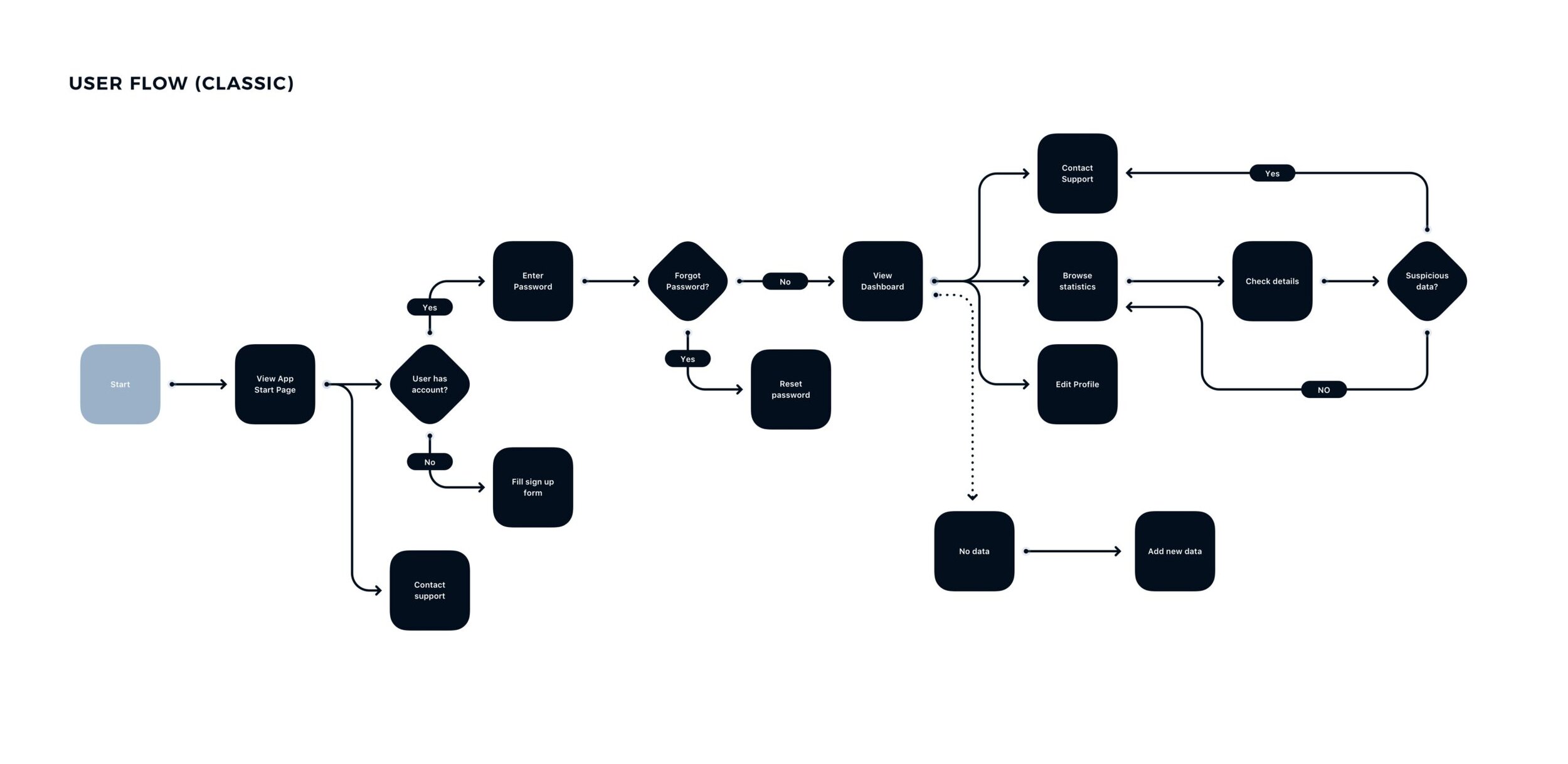
A great example of a user flow, as shown by UXMisfit.com
Depending on the task at hand and what options the user has, different types of flow charts can be used. For the Amazon example used previously, that would be a task flow, as it focuses on a specific task that will be the same for every user. On the other hand, user flows focus on a specific user and a scenario they may go through. Wire flows are a mix of wireframes and user flows, allowing a better look at how the design interacts with the flow, though not allowing for as in-depth scenarios.
My User Flow
Utilizing my mobile information architecture for the Doylestown website, I wanted to create a few different potential user flows for a potential app. Before creating the flows, I tried to determine what the main audience for the app would be. More specifically, what would residents and visitors of the town most need an app for. When accounting for the strengths of a mobile device as well as what town sites are typically used for (paying taxes and tickets, applying for permits), I was able to come up with three different user scenarios
Jennifer

For my first flow, new resident to the town Jeniffer wants to walk the trail more, but often gets lost on the way due to the many divergent paths. For her, the app would be most helpful if she could quickly go in and see a map of the many different routes the trail goes. Out of the three flows, this was the simplest as it had a fairly clear end goal. I thought about potential scenarios where they wouldn’t like the trail and select a new one, but overall the flow was consistent.
Terry

For the second flow, current resident Terry wants to get more involved in his town’s local scene, but doesn’t know where to start. Ideally, the app would show him a wide array of different things to do in town and where they're located. This was a bit more complicated than the last one, as there were quite a few varying end goals. I also added in actions such as “save address” so that the user would have a more quantifiable end goal than simply gaining enough information.
Grace

For the last flow, Grace is visiting the town for Spring Break to see family and wants to try biking when she’s there. Unfortunately, she isn't sure on the bike rules of the state and is nervous she may get in trouble for biking in the wrong area. Compared to the other two, there was less action in this flow and more viewing of different screens. For the bottom part of the chart, I also felt having all the options lead to a similar result, a readable PDF, made the flow much more consistent for the user.