Mobilizing Your Information Architecture
While designing an information architecture for the web and designing one for mobile may seem like completely different beasts, they’re actually quite similar and many of the same principles apply to both. They aren’t completely identical though, with some mobile specific items that remain of key importance.
Understanding your medium
The main difference when designing an information architecture around a mobile app vs a website is understanding the core benefit of the medium your designing for. Interaction-Design has an extensive article on some of the key differences and areas of focus for a mobile info arch, but this statement I feel is the most important “Deliver what’s important on the mobile platform...focus on what’s important to the user when they’re using a smartphone”
The article goes into many more examples with all of them at their core following the same principles of being simple and efficient. Compared to a website, apps have a far smaller area of room to work with. This means you have far less space to display your content, making what should be displayed of the utmost importance. Apps are also focused only on touch screens, meaning any actions done need to be able to be done with just a touch/swipe/hold. Understanding all of this is key to making an effective app. If you simply transfer over your web information arch, you will likely leave users lost and confused, as well as having certain features be unusable.
What’s interesting is that due to the popularity and frequency of mobile devices, most designs now are actually focused towards mobile users first, which makes sense. As the article linked said, there’s over 4 billion mobile users, with many of them having said mobile phones to be their main source of internet access. This means that in all likelihood, your website is being viewed mobile anyway. All of that combined shows that not only is designing a premium mobile experience important, it may be what’s most essential for having a successful app or website.
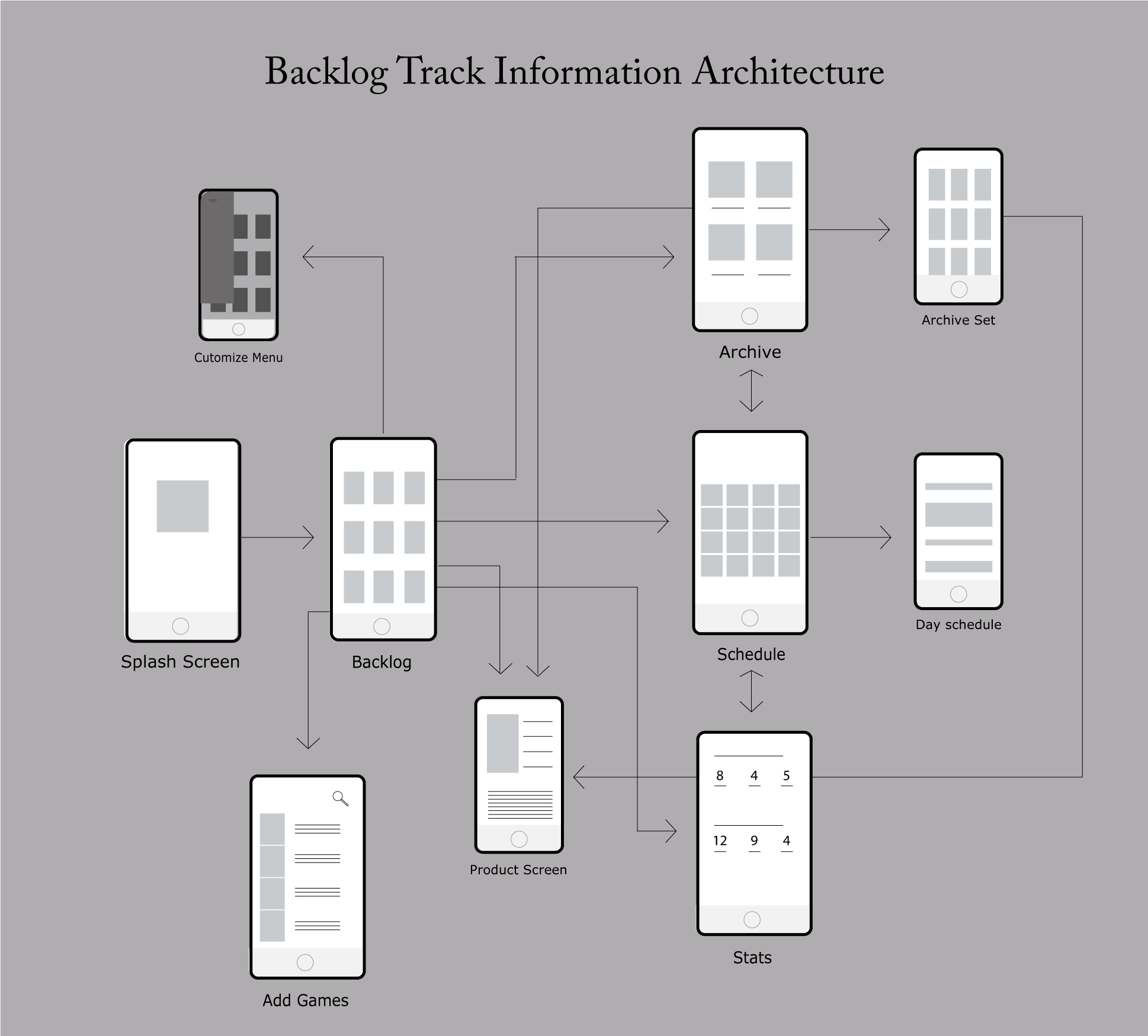
This is a look at my information architecture for my mobile app BacklogTrack. I used iPhone screens as a sample to better show the user journey through the app
Mobile Information Architecture
To get another test at making mobile information architecture, I took the same site I used for my previous Information Architecture and made a mobile app based version. Before beginning my design, I tried to get my brain moving with some ideation exercises. I’ve found “Worst Idea Possible” to be very helpful to me in these scenarios, since it gets my mind moving due to me not overthinking whether my ideas are good or not.
The ideas I came up with were all based around navigation, such as it taking over five clicks to get to key information or having the name of the navigation header be inaccurate. Overall, using this, combined with my preliminary research, I focused on easy and simple navigation being the core of this potential phone app
My information architecture for a potential mobile app version of the town site. I tried to make sure the navigation was as simple as possible
In the end, I felt the focus of the app should be focused on what the average citizen would need. This means I tried to focus less on government info and welcoming new residents and more on what current residents would want. This I felt was things such as service requests, permit application, and news/events.
I also tried to make sure the navigation was as simple as possible. Each area only goes three to four layers deep, with the user always knowing how they got there and having the ability to retrace their steps. I also tried to separate services into two different areas so that users could identify quicker what services they may actually need.


