BacklogTrack
For this project, I wanted to create an app that would help people manage their ever growing entertainment backlogs. Throughout the process, I’ve created a number of different artifacts, including user research, information architectures, and a high-fidelity prototype.
Below is a detailed summary of this process, including each artifact that was created.


Competitive Analysis
To begin the process, I performed a competitive analysis. Specifically, I wanted to see what other backlog apps were available in the Apple App Store, as well as what users typically seemed to like and dislike for those applications. Through this analysis, I was able to find that most backlog apps were pretty lacking. All the user bases were quite small and all of the focus was on video games rather than all entertainment. This helped show me both what I need to do to make my app stand out, as well as what has worked the best for apps like these, such as a playlist feature.

User Interview and Empathy Map
With a better idea of the competition, I then moved on to user interviews. Due to time constraints, I was only able to perform one interview, though I still got some good information from it. My interviewee (Jim) helped show how managing a backlog is often more mental than logistical. He knows what’s on his backlog and what he usually likes to play, but the intimidation of the size and pressure he feels to shrink this backlog causes him to enjoy the games and movies less. With this in mind, I knew that I had to focus on features beyond just tracking the backlog, features that would incentivize people to play/watch and get the most enjoyment they can.

Personas
With a better understanding of what a potential user may want, I created user personas to get a clearer picture of what my audience would be. I tried to make the personas diverse, focusing on different age groups, as well as their main form of entertainment consumption. These helped show how an actual person may want to use this app. It’s one thing to say there needs to be a better way to keep a backlog, but writing out potential scenarios, with concepts such as how it affects your interaction with friends or alters a games enjoyment, makes it easier to ideate on more concrete features the app would contain.
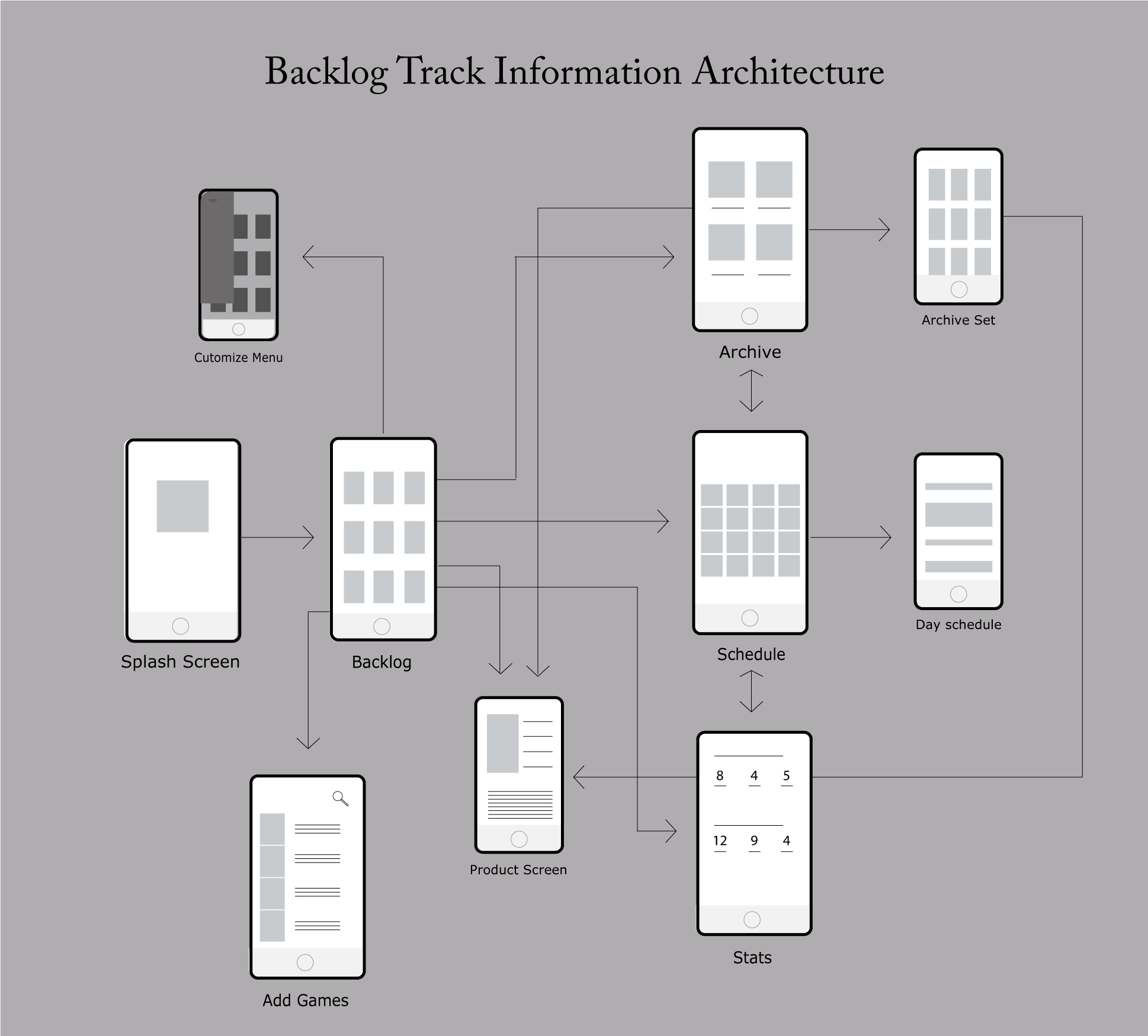
Information Arch
Now with a clear audience, I began creating the information architecture. With my user research in mind, I choose screens such as a customizable archive and a schedule as the focus, since that was a common issue in both my competitive analysis and user interview. I also wanted to make sure the app flowed well, not having too many screens and allowing the user to find the game/movie they want efficiently. For the final product, much of the content will be taken up by all the different games and movies synched with the app that you can find.

Wireframes
With all the research done and a structure decided upon, I began creating wireframes for the app. To create these wireframes, I used the program InVision. When creating the wireframes, I knew I wanted the visual focus of the app to be the covers of all the different games and movies, with brief descriptions and what not only put in when necessary. This would make the app a lot easier to scroll through since there’s little reading, as well as inspiring people to play/watch certain games/movies due to an interesting cover.

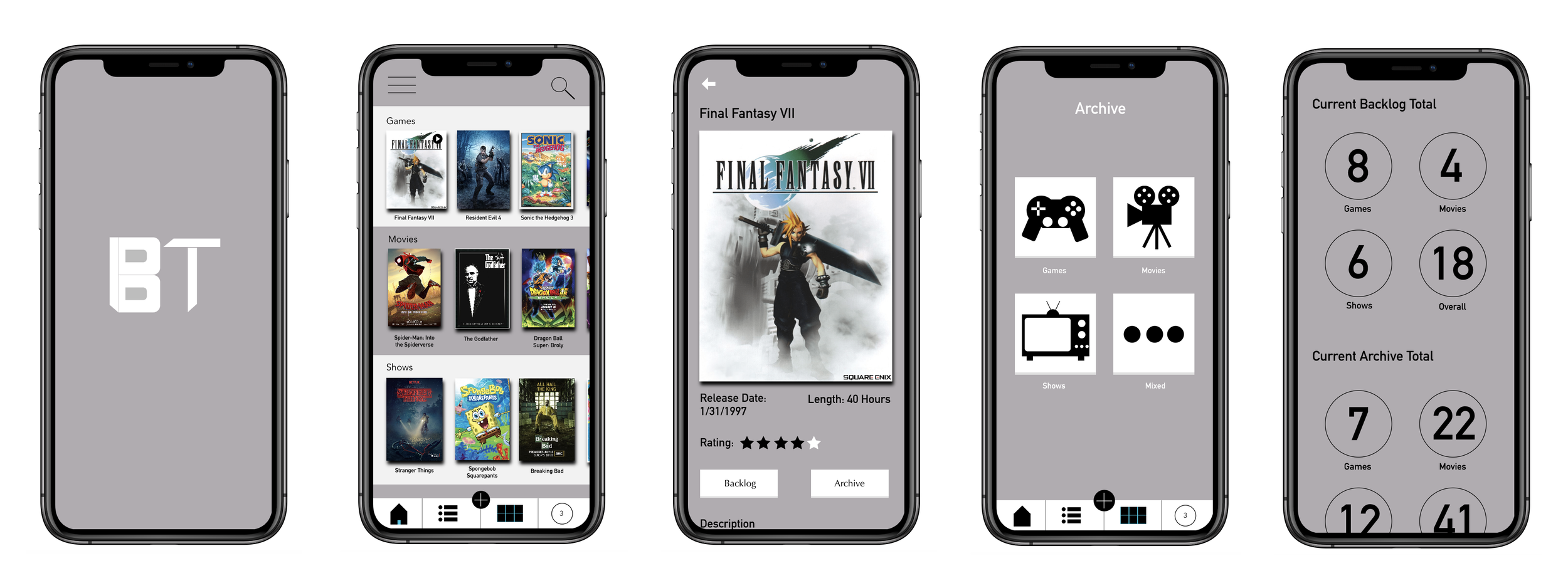
Mock Up
Now that the structure was decided, all that’s left was putting in the color and detail. Originally, I wanted the main color to be a sort of metallic blue, as I felt that would present a more “techy” feel. As I soon found though, the color was too dark, causing the covers to blend in the background rather than be the focus like they should be. Due to that, I ended up going with a lighter gray as the main color, as I felt it still provided a “techy” feel (think Apple silver) while being light enough to make the game covers stick out.