Destination Doylestown
For this project, I was tasked with making a companion phone for a government website. The website I choose was Doylestownborough.org, with the app being called Destination Doylestown
Below is a detailed look at my full process for this project, including items such as an information architecture, users flows, and a high-fidelity prototype.


Information Architecture Redesign
To begin the process, I first wanted to recreate the information architecture for the original site. Similar to many government sites, the information architecture is often all over the place, having confusing navigation titles such as “More like this” and repeating the same information over and over. Due to that, I felt I needed a cleaner information architecture to work with before I could decide what would be in the phone app. I first started by mapping out the original info arch to about three levels deep, then took that architecture and remapped it to what I felt was best.

Mobile Information Architecture
With a redesigned architecture in place, I could now determine what would make it into the phone app, as well as what would be the focus. As it’s a phone app, the scale must be smaller than the full desktop app. Due to that, I decided to cut most of the government section, as it’s simply info dumps and wouldn’t be very useful for a user on the go. I also decided to expand the services screen, taking tabs from all over the website and organizing them between resident services and business services. Finally, the community section stayed mostly the same, with me just picking what I felt would be most useful for a user on the go.

User Flows
With a structure in place, I needed to see how the app itself flowed. To do that, I created three separate user flow scenarios, each focusing on a different aspect of the app. This included more railroaded features with little choice, such as selecting a map to download, versus the more open choices like finding a community feature to get involved with. Even with the more open ended choices, the overall flow of the app remained fairly simply throughout, only taking a few taps to get through most features.

Paper Prototype
With everything in place, I began making my initial prototype. While I typically use a program like InVision to create the prototype, that’s often quite time consuming. With how many unique screens there are throughout the app, I instead decided to make a paper prototype. By drawing out the screens by hand, I was able to rapidly develop multiple screens, as well as be more efficient at simply getting my ideas out on the table.

User Testing
With a prototype now ready, I could begin testing other users to see how they flowed through the app. These tests were designed like an interview, with a full script and specified tasks for the user to go through. From these tests, one of the main issues that occurred was the navigation. Multiple users were confused, both unsure of what the icons meant, as well as what features would be under what tab. Along with that, some users felt there was a lack of clear information in some screens, such as the ticket payment options.
High-Fidelity Prototype
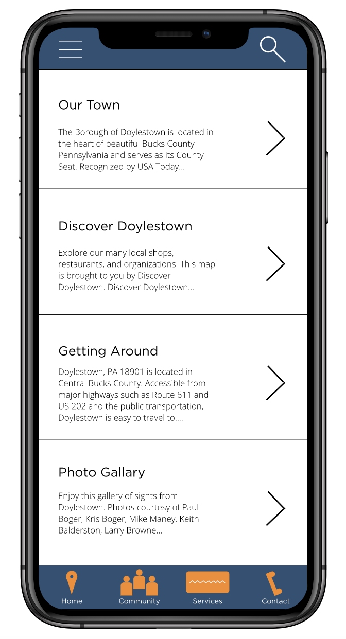
With critique from my user testing in mind, I then created my high-fidelity prototype. To create the prototype, I used the program InVision, basing each design off my paper prototypes making changes when needed.
The main benefit of this prototype was being able to make the hierarchy and overall navigation of the site much clearer. Features such as bolded text, names under the nav icons and different fonts made it easier to decipher what meant what. Below is a link to my full prototype